> ## Documentation Index
> Fetch the complete documentation index at: https://guide.garde.app/llms.txt
> Use this file to discover all available pages before exploring further.
# Sales
> Check sales over time, by day, by hour, and by channel.
**Sales** answers three questions: how much are we selling, when, and through which door. Data comes straight from your POS, so the numbers here match the register. No exports, no spreadsheets.
Two pages under Sales in the sidebar: **Overview** and **Channels**.
## The overview
 Top cards first:
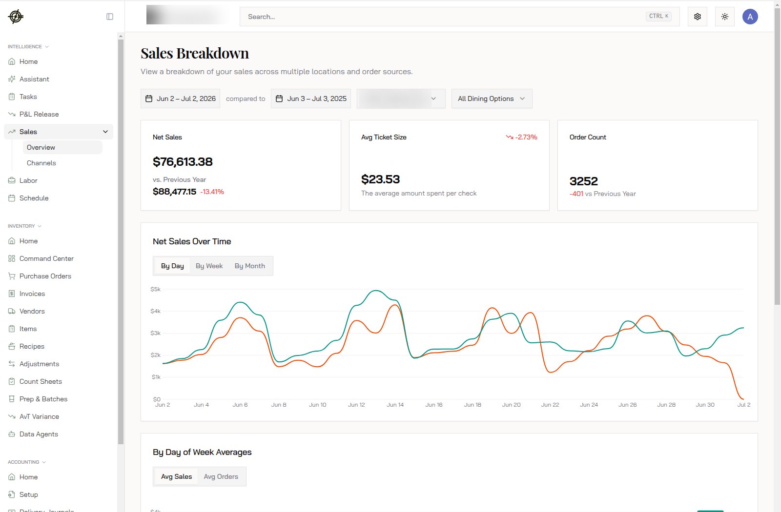
* **Net Sales** for the range you picked, against the comparison period. $76,613.38 this period vs. $88,477.15 last year is -13.41%. That's the headline.
* **Avg Ticket Size**: net sales divided by checks. \$23.53 and drifting down 2.73% means guests are spending less per visit, not that fewer are coming.
* **Order Count**: 3252 orders, -401 vs. last year. Pair it with ticket size to know if the problem is traffic or spend.
Then the **Net Sales Over Time** chart. Your period is one line, the comparison is the other. Toggle **By Day / By Week / By Month** to zoom out. A single bad day looks scary by day and invisible by month; use both.
### Averages by day and by hour
Scroll down for the two charts that should drive your schedule:
Top cards first:
* **Net Sales** for the range you picked, against the comparison period. $76,613.38 this period vs. $88,477.15 last year is -13.41%. That's the headline.
* **Avg Ticket Size**: net sales divided by checks. \$23.53 and drifting down 2.73% means guests are spending less per visit, not that fewer are coming.
* **Order Count**: 3252 orders, -401 vs. last year. Pair it with ticket size to know if the problem is traffic or spend.
Then the **Net Sales Over Time** chart. Your period is one line, the comparison is the other. Toggle **By Day / By Week / By Month** to zoom out. A single bad day looks scary by day and invisible by month; use both.
### Averages by day and by hour
Scroll down for the two charts that should drive your schedule:
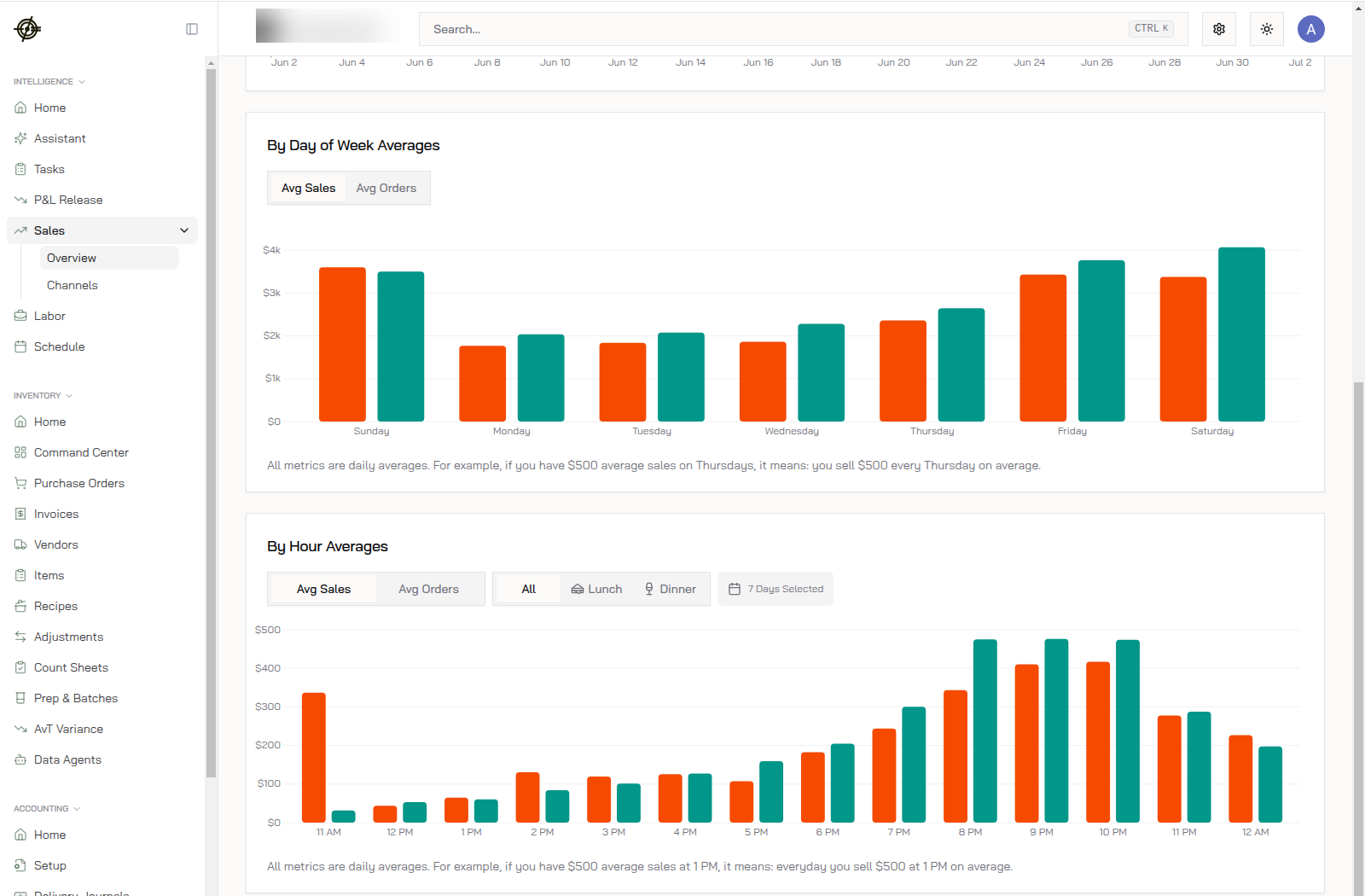 * **By Day of Week Averages**: your real busy days. Gut says Friday; here, Saturday and Sunday out-earn it. Orange is your period, green is the comparison.
* **By Hour Averages**: when the rushes actually hit. This store does almost nothing until 6 PM, then peaks 8 to 10 PM. Staffing a full crew at noon here is a donation.
* Filter the by-hour chart to **Lunch** or **Dinner**, or to specific days, when you're building the schedule for one daypart.
* These are daily averages. $500 average on Thursdays means you sell $500 every Thursday on average, not \$500 total.
## Channels
Open **Sales → Channels** to split sales into dine-in, takeout, delivery, and each third-party platform.
* **By Day of Week Averages**: your real busy days. Gut says Friday; here, Saturday and Sunday out-earn it. Orange is your period, green is the comparison.
* **By Hour Averages**: when the rushes actually hit. This store does almost nothing until 6 PM, then peaks 8 to 10 PM. Staffing a full crew at noon here is a donation.
* Filter the by-hour chart to **Lunch** or **Dinner**, or to specific days, when you're building the schedule for one daypart.
* These are daily averages. $500 average on Thursdays means you sell $500 every Thursday on average, not \$500 total.
## Channels
Open **Sales → Channels** to split sales into dine-in, takeout, delivery, and each third-party platform.
 How to read the cards:
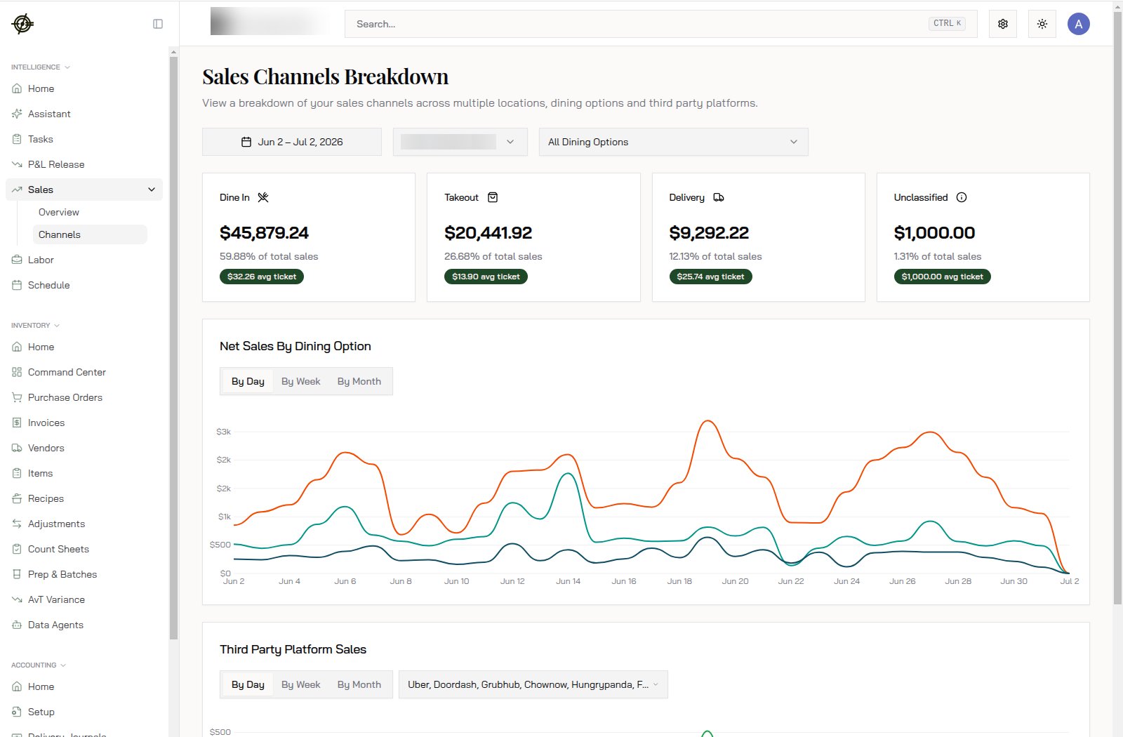
* Each channel shows dollars, share of total, and average ticket. Here: Dine In $45,879.24 at 59.88% of sales with a $32.26 ticket; Takeout $20,441.92 at 26.68% with $13.90; Delivery $9,292.22 at 12.13% with $25.74.
* The ticket gap is the insight. Delivery tickets near double takeout tickets means delivery guests order for the table; takeout guests grab one item. Bundle accordingly.
* **Unclassified** means orders the POS didn't tag with a dining option. A small sliver is normal; a growing one means the POS workflow needs fixing.
* **Third Party Platform Sales** at the bottom splits Uber, DoorDash, Grubhub, ChowNow, HungryPanda, and the rest. This is where you see which platform is growing and which is dead weight.
Use Channels to answer:
* Is third-party volume worth the commission? Pair this with [delivery deposits](/platform/accounting-quickbooks) to see the net after fees.
* Is dine-in recovering or are you becoming a delivery kitchen?
## The weekly habit
1. Monday: open Sales, compare last week vs. the week before.
2. Sales dipped? Check by-day first. One bad Saturday is weather; four is a trend.
3. Then check ticket vs. orders. Traffic problems and spend problems have different fixes.
4. Channel mix shifted? Decide if the pricing or promo on that channel still makes sense.
Don't stare at charts daily. Weekly, with a question in mind.
## Know-how
* The date picker sets both the range and the comparison. Default comparison is the same range a year back; change either side independently.
* The **All Dining Options** filter applies to the whole page. Filter to Dine In before judging ticket size trends; delivery mix shifts can mask what's happening at tables.
* Multi-location? The location dropdown compares stores one at a time. For side-by-side location numbers, ask the [Assistant](/dashboard/assistant).
* Numbers don't match the POS? Same date range, same location, then see [POS integrations](/platform/pos-integrations) troubleshooting.
How to read the cards:
* Each channel shows dollars, share of total, and average ticket. Here: Dine In $45,879.24 at 59.88% of sales with a $32.26 ticket; Takeout $20,441.92 at 26.68% with $13.90; Delivery $9,292.22 at 12.13% with $25.74.
* The ticket gap is the insight. Delivery tickets near double takeout tickets means delivery guests order for the table; takeout guests grab one item. Bundle accordingly.
* **Unclassified** means orders the POS didn't tag with a dining option. A small sliver is normal; a growing one means the POS workflow needs fixing.
* **Third Party Platform Sales** at the bottom splits Uber, DoorDash, Grubhub, ChowNow, HungryPanda, and the rest. This is where you see which platform is growing and which is dead weight.
Use Channels to answer:
* Is third-party volume worth the commission? Pair this with [delivery deposits](/platform/accounting-quickbooks) to see the net after fees.
* Is dine-in recovering or are you becoming a delivery kitchen?
## The weekly habit
1. Monday: open Sales, compare last week vs. the week before.
2. Sales dipped? Check by-day first. One bad Saturday is weather; four is a trend.
3. Then check ticket vs. orders. Traffic problems and spend problems have different fixes.
4. Channel mix shifted? Decide if the pricing or promo on that channel still makes sense.
Don't stare at charts daily. Weekly, with a question in mind.
## Know-how
* The date picker sets both the range and the comparison. Default comparison is the same range a year back; change either side independently.
* The **All Dining Options** filter applies to the whole page. Filter to Dine In before judging ticket size trends; delivery mix shifts can mask what's happening at tables.
* Multi-location? The location dropdown compares stores one at a time. For side-by-side location numbers, ask the [Assistant](/dashboard/assistant).
* Numbers don't match the POS? Same date range, same location, then see [POS integrations](/platform/pos-integrations) troubleshooting.