

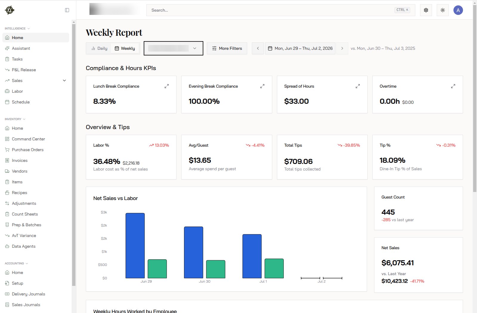
What’s on the report
Top to bottom:- Daily / Weekly toggle: flip between today’s report and the running week. Weekly is the default habit; Daily is for “what happened last night”.
- Compliance & Hours KPIs: break compliance, spread of hours, and overtime. A lunch break compliance of 8.33% means almost nobody took their break. That’s a lawsuit line item, not a footnote.
- Overview & Tips: labor as a percent of net sales, average spend per guest, total tips, tip percent. Each card shows the change vs. the comparison period in red or green.
- Net Sales vs Labor chart: bars per day, sales next to labor. This is the fastest way to spot a day where labor didn’t scale down with sales.
- Guest Count and Net Sales cards: this week against the same week last year. A week at 445 guests and 10,423.12 last year is a conversation, not a chart.
- Weekly Hours Worked by Employee: who’s on pace for overtime before it happens.
How to read it
- Open it with your morning coffee. Two minutes.
- Scan the red numbers first. Red on Labor % means labor grew faster than sales.
- Check the vs.-last-year cards. Down week over week can be weather; down year over year is a trend.
- Something looks off? Click through to Sales or Labor and find out why.
- Nothing looks off? Close the laptop and run the restaurant.
Know-how
- The comparison period is the same dates a year earlier (shown next to the date picker, e.g. “vs. Mon, Jun 30 – Thu, Jul 3, 2025”). Change the date range with the arrows or calendar.
- Labor % is labor cost over net sales for the same window. A 36.48% labor week on 2,216 went to labor. Over 30% deserves a look; over 35% deserves action.
- Overtime showing 0.00h midweek doesn’t mean you’re safe. Check Weekly Hours Worked by Employee at the bottom for who’s already past 30 hours by Wednesday.
- More Filters lets you cut the report by dining option or other dimensions when a number needs a second look.
- Multi-location? The location dropdown under the title controls the whole report. Wrong store is the #1 cause of “these numbers are wrong”.
Tasks
Tasks (in the Intelligence section) is the Work Pipeline: a prioritized queue of things that need a human, generated from your data and from teammates.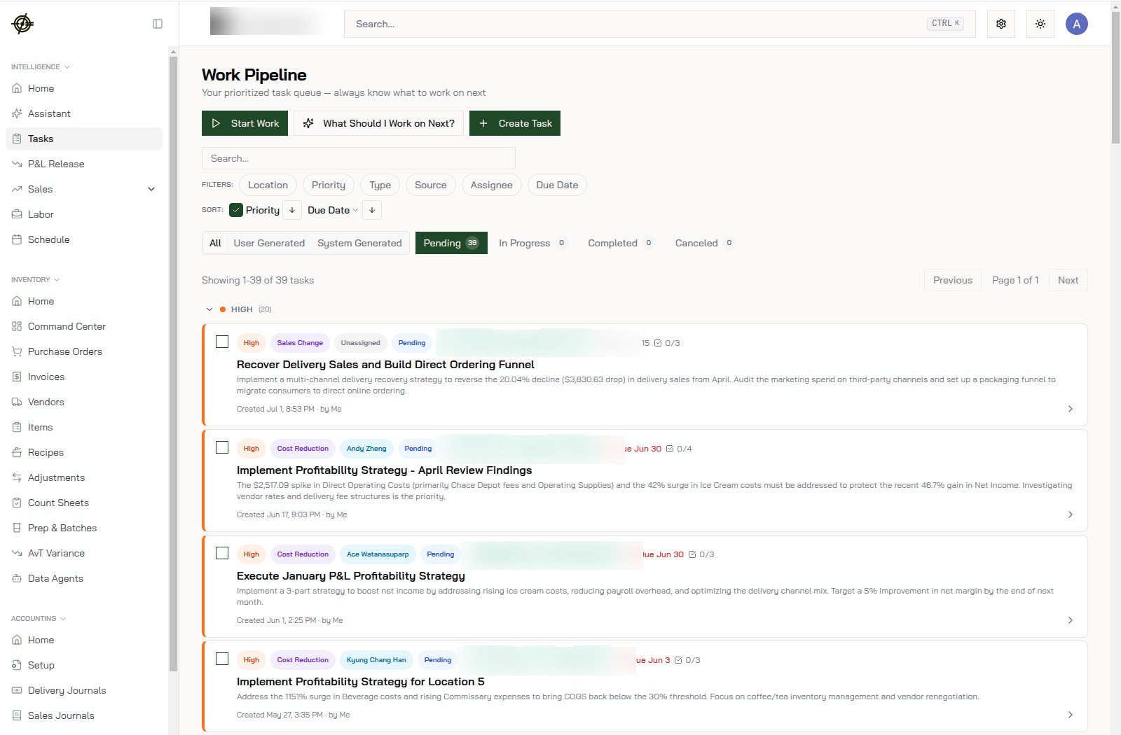
- Tasks come in two flavors: user generated (someone created it) and system generated (the AI spotted something, like a 20% delivery sales decline, and wrote up the fix).
- Each task carries a priority, an assignee, a due date, and sub-steps. Filter by location or assignee to see just your plate.
- Not sure where to start? Hit What Should I Work on Next? and let it pick.
- Check it after Home each morning. Clear it before it clears you.